
One Website. Every Screen. Every Experience.
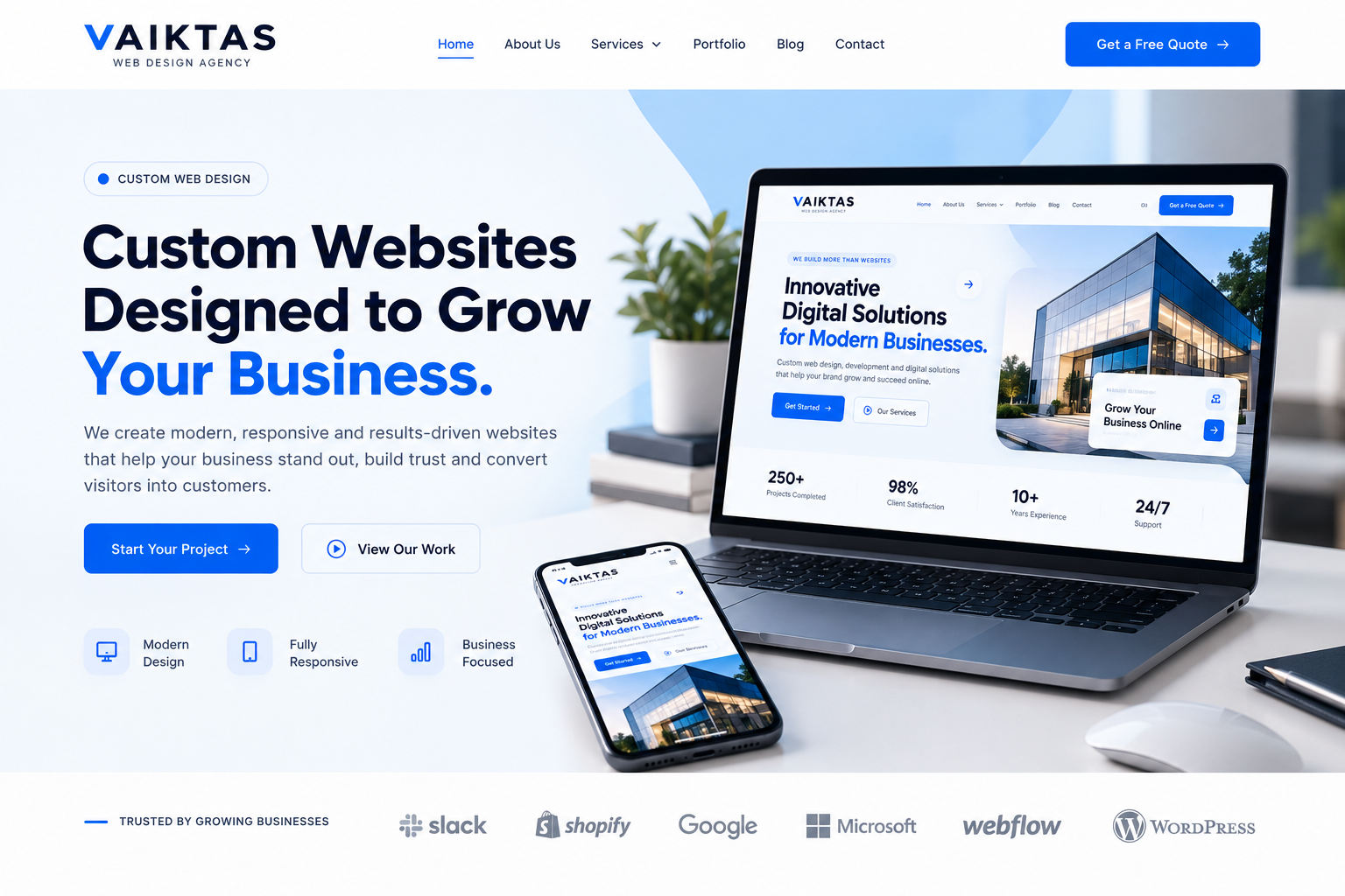
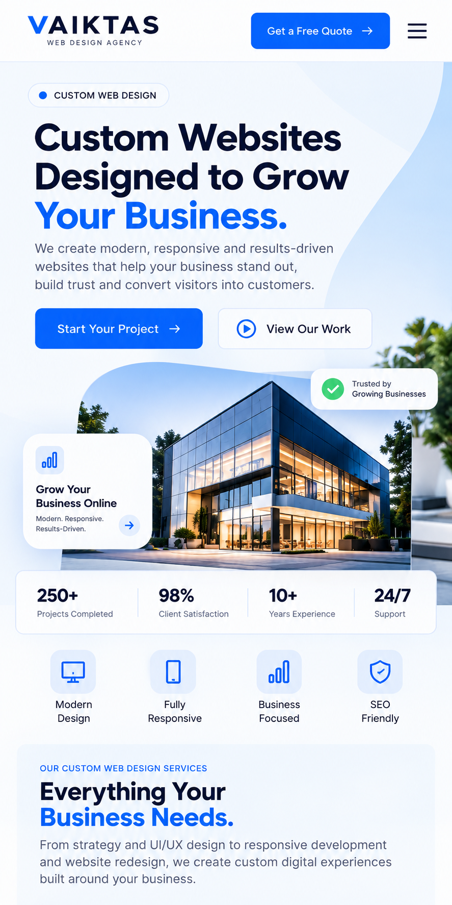
Create a modern website that automatically adapts to desktops, tablets and mobile devices, giving your customers a smooth and consistent experience wherever they visit.
One Website. Built for Every Screen.
Your customers may visit your website from a desktop, tablet or smartphone. A responsive website automatically adapts to each screen size, creating a consistent, easy-to-use experience across every device.
Grow Your Business →Better User Experience
Give visitors a smooth and intuitive experience, regardless of the device they use.
Mobile-First Experience
Make your website comfortable to browse, interact with and navigate on smartphones.
Flexible & Future Ready
Build a website that adapts to new screen sizes and devices as technology evolves.
Responsive Solutions for Every Business Need.
From business websites to e-commerce platforms, we create responsive digital experiences that look and work beautifully across desktop, tablet and mobile devices.
 01
↗
01
↗
Responsive Business Websites
Professional business websites designed to deliver a seamless experience across every screen.
Explore Service → 02
↗
02
↗
Mobile-First Web Design
Design experiences around mobile users first, then scale beautifully to larger screens.
Explore Service → 03
↗
03
↗
Responsive E-Commerce Design
Create shopping experiences that make browsing, product discovery and purchasing easy on every device.
Explore Service → 04
↗
04
↗
Responsive UI / UX Design
Flexible interfaces with intuitive navigation, clear layouts and consistent user experiences.
Explore Service → 05
↗
05
↗
Responsive Landing Pages
Campaign-focused landing pages optimized for conversions across desktop, tablet and mobile.
Explore Service → 06
↗
06
↗
Responsive Website Redesign
Transform an existing website into a modern, flexible and mobile-friendly experience.
Explore Service →From Design to a Seamless Multi-Device Experience.
We carefully plan, design and test every part of your website to ensure it delivers a consistent experience across desktop, tablet and mobile.
Discover
Understand your business, audience, website requirements and device usage.
Design
Create responsive layouts and user experiences that adapt naturally to different screen sizes.
Develop
Build flexible layouts, components and functionality that work smoothly across devices.
Test & Launch
Test the website across screen sizes, browsers and devices before delivering the final experience.
One Website. Perfectly Adapted.
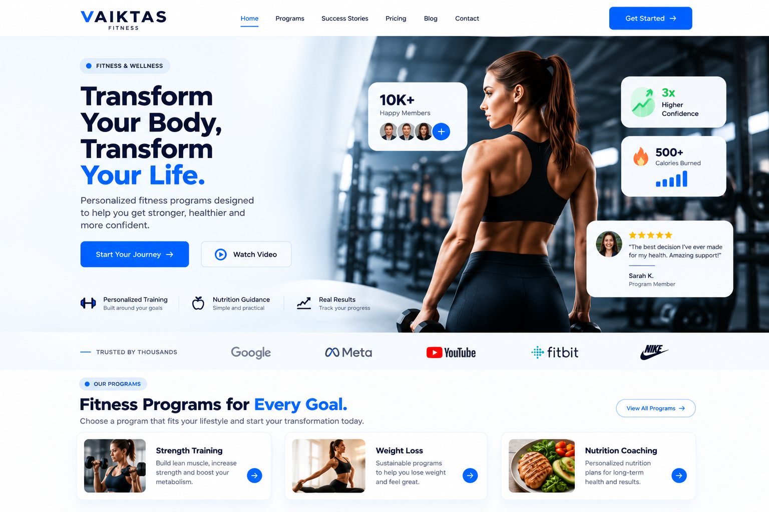
We design responsive websites that automatically adapt to every screen size, creating a consistent and intuitive experience from desktop to mobile.
Responsive by Design
Every layout is designed to adapt naturally to different screen sizes and orientations.
Mobile-First Experience
We prioritize mobile usability so your website remains easy to browse and interact with.
Consistent Brand Experience
Your visual identity, content and messaging remain consistent across every device.
Performance Focused
Responsive layouts are built with usability, speed and smooth interaction in mind.
Future Ready
Flexible layouts help your website adapt to new devices and changing screen sizes.
From One Fixed Layout to Every Screen.
Responsive design transforms a website from a fixed desktop layout into a flexible experience that works naturally across desktop, tablet and mobile devices.
Fixed Website
Fixed Desktop Layout
Poor Mobile Experience
Content Requires Scrolling
Inconsistent Screen Layout
Responsive Website
Flexible Responsive Layout
Mobile-First Experience
Optimized for Every Screen
Consistent User Experience
We Don't Just Make Websites Responsive. We Make Them Work Better.
We combine responsive UI/UX, business understanding and performance-focused development to create websites that deliver a consistent experience across every screen.
Business-Focused Strategy
We design around your business goals, audience and customer journey — not just screen sizes.
Mobile-First Thinking
We make sure your website remains easy to browse, navigate and interact with on smaller screens.
Consistent User Experience
Your brand, content and functionality remain consistent from desktop to mobile.
Long-Term Support
We help you maintain, improve and adapt your website as your business continues to grow.